Compare Charts in GoCharting
GoCharting’s Compare Charts feature enables traders to analyze multiple securities or indicators side by side. This functionality is essential for identifying correlations, trends, and divergences between different assets, enhancing decision-making and strategy development.
How to Use Compare Charts
- Select the Compare Option: Start by choosing the “Compare” option from the chart menu.
- Add Instruments: Add the desired securities or indicators you wish to compare.
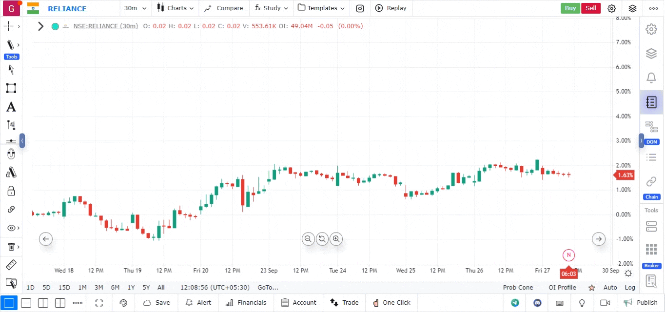
Adjusting for Price Differences
If the prices of the instruments being compared vary significantly, you can switch to a % Scale for a more effective comparison:
- Enable % Scale: Right-click on the Y-axis (price axis) of the chart and select ”% Scale” from the context menu.
Using the % Scale allows for a clearer visual representation of price movements, making it easier to analyze relative performance and trends between the selected instruments. This feature empowers traders to gain deeper insights into market dynamics at a glance.
Use Case
The Compare Chart feature overlays multiple instruments on a single chart to analyse relative performance and correlation. It is used by portfolio traders to identify which assets are outperforming, lagging, or diverging from one another.
Strategy
Use Compare Charts to spot divergences: when your primary asset breaks to a new high but the benchmark or correlated instrument fails to follow, it signals potential relative weakness. This can be used for pairs trading or for timing entries based on relative strength reversals.
Common Mistakes
Do not use Compare Charts with instruments that have fundamentally different scales without normalising the baseline. Avoid drawing exact support/resistance levels on compare chart overlays — levels apply only to the primary instrument. Do not confuse correlation with causation when interpreting comparison results.