Plots
Introduction
The plot() function is the most frequently used function to display information calculated using Lipi Script. It is versatile and can plot different styles of lines, histograms, areas, columns (like volume columns), fills, circles, or crosses.
This script showcases a few different uses of plot() in an overlay script:
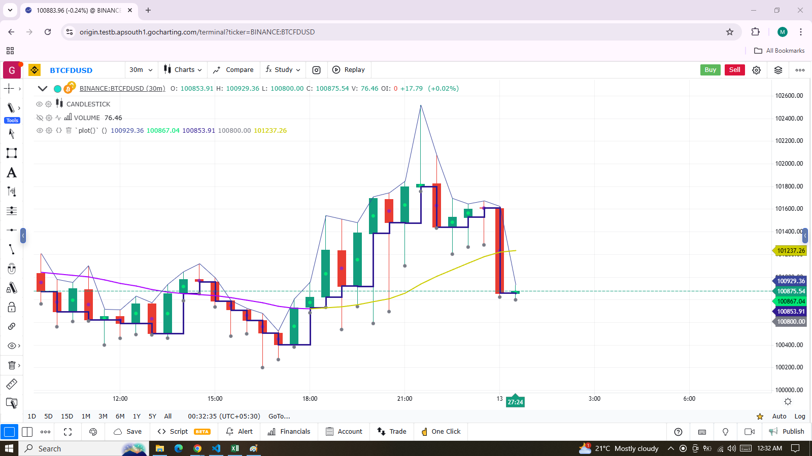
indicator("`plot()`", "", true)
plot(high, "Blue `high` line")
plot(math.avg(close, open), "Crosses in body center", close > open ? color.lime : color.purple, 6, plotStyle.scatter)
plot(math.min(open, close), "Navy step line on body low point", color.navy, 3, plotStyle.stepLine)
plot(low, "Gray dot on `low`", color.gray, 3, plotStyle.scatter)

color VIOLET = #AA00FF
color GOLD   = #CCCC00
ma = ta.alma(hl2, 40, 0.85, 6)
static almaColor = color.silver
almaColor := ma > ma[2] ? GOLD : ma < ma[2]  ? VIOLET : almaColor
plot(ma, "Two-color ALMA", almaColor, 2)
Note that:
- The first
plot()call plots a 1-pixel blue line across the bar highs. - The second call plots crosses at the mid-point of bodies. The crosses are colored lime when the bar is up and purple when it is down. The argument used for
linewidthis 6, but it is not a pixel value; it is just a relative size. - The third call plots a 3-pixel wide step line following the low point of bodies.
- The fourth call plots a gray circle at the bars’ low.
- The last
plot()requires some preparation:- First, we define our bull/bear colors and calculate an Arnaud Legoux Moving Average (ALMA).
- Then, we make our color calculations. We initialize our
colorvariable on bar zero only, usingstatic. - It is initialized to color.silver, so on the dataset’s first bars—until one of our conditions causes the color to change—the line will remain silver.
- The conditions that change the line’s color require it to be higher/lower than its value two bars ago. This approach creates less noisy color transitions than merely comparing the value to the previous bar.
This script demonstrates other uses of plot() in a pane:
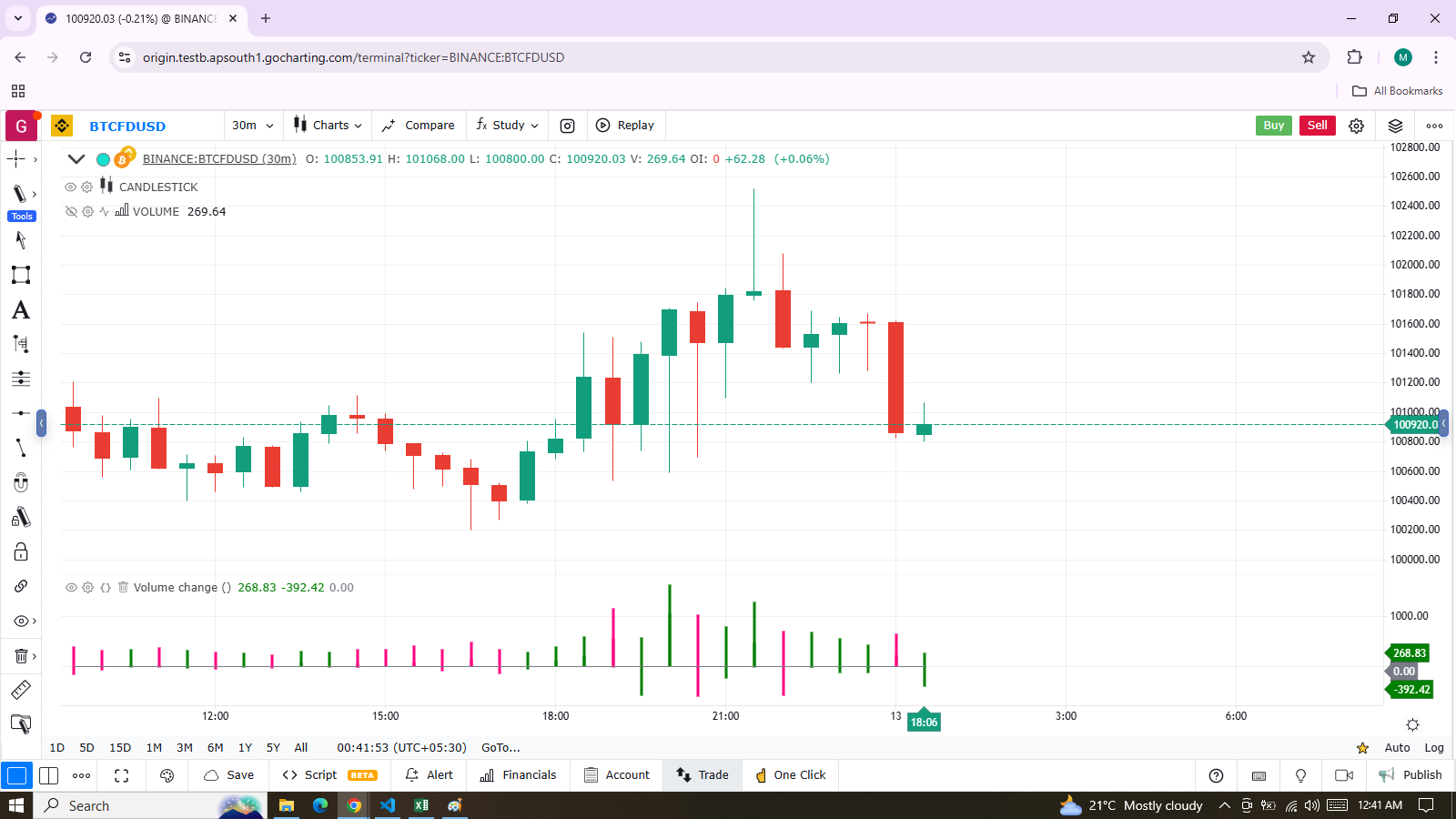
indicator("Volume change", format = format.volume)

color GREEN         = #008000
color GREEN_LIGHT   = color.new(GREEN, 50)
color GREEN_LIGHTER = color.new(GREEN, 85)
color PINK          = #FF0080
color PINK_LIGHT    = color.new(PINK, 50)
color PINK_LIGHTER  = color.new(PINK, 90)

bool  barUp = talib.rising(close, 1)
bool  barDn = talib.falling(close, 1)
float volumeChange = talib.change(volume)

volumeColor = barUp ? GREEN_LIGHTER : barDn ? PINK_LIGHTER : color.gray
plot(volume, "Volume columns", volumeColor, style = plotStyle.bar)

volumeChangeColor = barUp ? volumeChange > 0 ? GREEN : GREEN_LIGHT : volumeChange > 0 ? PINK : PINK_LIGHT
plot(volumeChange, "Volume change columns", volumeChangeColor, 12, plotStyle.histogram)

plot(0, "Zero line", color.gray)
Note that:
-
We are plotting normal volume values as wide columns above the zero line (see the
style = plotStyle.columnsin ourplot()call). -
Before plotting the columns, we calculate our
volumeColorusing the values of thebarUpandbarDnboolean variables:- They become respectively true when the current bar’s close is higher/lower than the previous one.
- Note that the built-in “Volume” does not use the same condition; it identifies an up bar with
close > open. - We use the GREEN_LIGHTER and PINK_LIGHTER colors for the volume columns.
-
Since the first plot uses columns, the
linewidthparameter is not used, as it has no effect on columns. -
The script’s second plot represents the change in volume, calculated earlier using
talib.change(volume):- This value is plotted as a histogram, where the
linewidthparameter controls the column’s width. - We set
linewidthto 12, making histogram elements thinner than the columns in the first plot. - Positive/negative volumeChange values plot above/below the zero line without additional manipulation.
- This value is plotted as a histogram, where the
-
Before plotting the histogram of
volumeChangevalues, we calculate itscolorvalue, which can be one of four different colors:- Bright GREEN or PINK when:
- The bar is up/down, AND
- The volume has increased since the last bar (
volumeChange > 0). - These values plot above the zero line.
- Bright GREEN_LIGHT or PINK_LIGHT when:
- The bar is up/down, AND
- The volume has NOT increased since the last bar.
- These values plot below the zero line.
- Bright GREEN or PINK when:
-
Finally, we plot a zero line. Alternatively, we could have used
hline(0)for this purpose. -
We use
format = format.volumein ourindicator()call so that large values are displayed in an abbreviated format, similar to the built-in “Volume” indicator. -
Important Notes:
-
plot()calls must always be placed in a line’s first position, meaning they are always in the script’s global scope. -
They cannot be placed in user-defined functions or structures like
if,for, etc. -
However,
plot()can be designed to conditionally plot in two ways, as explained in the Conditional plots section of this page. -
A script can only plot in its own visual space:
- Scripts running in a pane can only color bars in the chart area.
- Scripts running on the chart as an overlay can only affect their designated overlay area.
-
plot() Parameters
The plot() function has the following signature:
plot(series, title, color, linewidth, style, histbase, offset) → plotThe parameters of plot() are:
series
- This is the only mandatory parameter.
- Its argument must be of “series int/float” type.
- Note: Because auto-casting rules in Lipi Script convert in the int 🠆 float 🠆 bool direction, a
booltype variable cannot be used directly. It must be converted to an int or float. - Example:
IfnewDayis ofbooltype, you can usenewDay ? 1 : 0to plot 1 when the variable is true and 0 when it is false.
title
- Requires a “const string” argument, meaning it must be known at compile time.
- The string appears:
- In the script’s scale when the “Chart settings/Scales/Indicator Name Label” field is checked.
- In the Data Window.
- In the Settings/Style tab.
- In the dropdown of
input.source()fields. - In the Condition field of the “Create Alert” dialog box when the script is selected.
- As the column header when exporting chart data to a CSV file.
color
- Accepts “series color”, allowing bar-by-bar calculations.
- Using
naas the color or any color with transparency set to 100 hides the plot when not needed.
linewidth
- Defines the plotted element’s size, though it does not apply to all styles.
- For lines, the unit is pixels.
- Has no effect when
plotStyle.baris used.
style
- Available styles:
plotStyle.line(default):- Plots a continuous line.
- Uses
linewidth(in pixels) for width. navalues are not plotted but are bridged when a non-navalue appears.
plotStyle.linebr:- Allows discontinuous lines by skipping
navalues without bridging gaps.
- Allows discontinuous lines by skipping
plotStyle.stepLine:- Creates a staircase effect, with transitions made via vertical lines drawn in the middle of bars.
plotStyle.area:- Plots a line with an area fill between the line and
histbase. - Uses
colorfor both the line and fill.
- Plots a line with an area fill between the line and
plotStyle.areabr:- Similar to
plotStyle.areabut does not bridge overnavalues. - Scale calculation is based only on plotted values.
- Similar to
plotStyle.bar:- Plots columns like the built-in “Volume” indicator.
linewidthdoes not affect column width.
plotStyle.histogram:- Plots columns where
linewidthsets the bar width in pixels. - Requires an “input int” value for consistent width across bars.
- Plots columns where
plotStyle.scatterandplotStyle.cross:- Plot shapes not joined across bars unless
join = true. linewidthis a relative size (not pixel-based).
- Plot shapes not joined across bars unless
histbase
- The reference point for
plot.style_area,plotStyle.bar, andplot.style_histogram. - Cannot be dynamically calculated (requires an “input int/float”).
offset
- Shifts the plot in the past/future using a negative/positive offset in bars.
- Cannot change during script execution.
Plotting Conditionally
plot() calls cannot be used within conditional structures like if. However, the display of plots can still be controlled by varying their plotted values or their color.
- When no plot is required, you can:
- Plot
navalues. - Use
nacolor or a color with 100 transparency, which also makes the plot invisible.
- Plot
Value Control
One way to manage plots conditionally is by using na values when no plot is required. It will return na value when gaps = barmerge.gaps_on is used. In such case, plotting discontinuous lines can be useful. The following script demonstrates a few methods to achieve this:
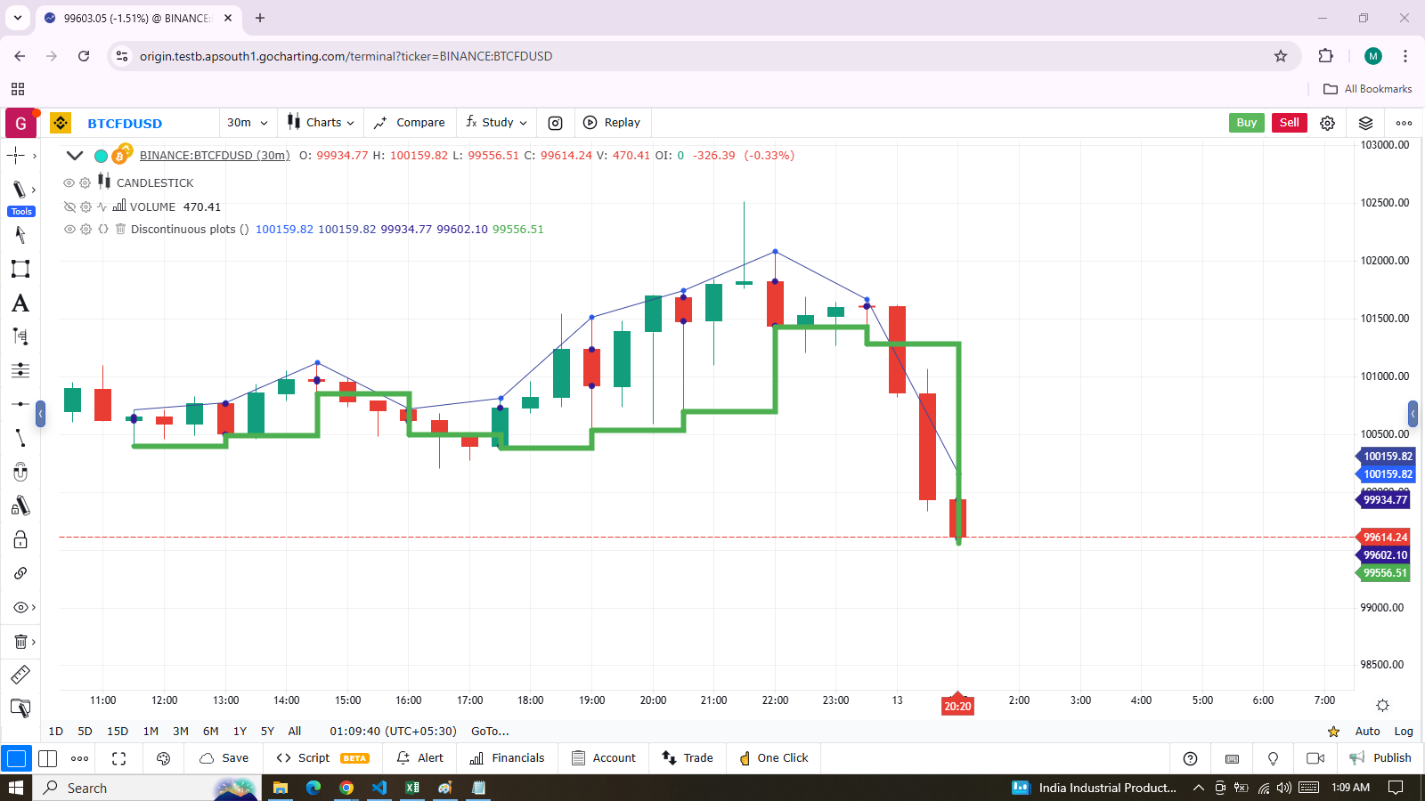
indicator("Discontinuous plots", "", true)
bool plotValues = bar_index % 3 == 0
plot(plotValues ? high : na, color = color.blue, linewidth = 6, style = plotStyle.linebr)
plot(plotValues ? high : na)
plot(plotValues ? math.max(open, close) : na, color = color.navy, linewidth = 6, style = plotStyle.scatter)
plot(plotValues ? math.min(open, close) : na, color = color.navy, linewidth = 6, style = plotStyle.scatter)
plot(plotValues ? low : na, color = plotValues ? color.green : na, linewidth = 6, style = plotStyle.stepLine)
Note:
-
Defining the Condition:
The condition for plotting is defined usingbar_index % 3 == 0, which evaluates totruewhen the bar index divided by 3 leaves a remainder of zero. This occurs every three bars. -
First Plot:
The first plot uses plotStyle.linebr to draw a fuchsia line on the highs. This line is centered at the horizontal midpoint of each bar. -
Second Plot:
The second plot illustrates the same values but without breaking the line. Here, the plainplot()call automatically bridges overnavalues (or gaps), resulting in a continuous thin blue line. -
Crosses and scatter:
Navy blue crosses and scatters are plotted on the body tops and bottoms usingplotStyle.crossandplotStyle.scatter. These styles provide a simple way to plot discontinuous values, which are useful for visualizing stop or take-profit levels, as well as support and resistance levels. -
Last Plot:
The last plot is a green line on the bar lows, created usingplotStyle.stepLine. Note:- Its segments are wider than those of the fuchsia line created with plotStyle.linebr.
- On the last bar, the line only extends halfway, waiting for the next bar to appear.
-
Plotting Order:
The display order of each plot is determined by their sequence of appearance in the script.
Color Control
The Conditional coloring section of the page on colors explains how to control colors for plots. Here, we will explore a few examples.
- The value of the color parameter in
plot()can be a constant, such as:- Built-in constant colors
- A color literal
In Lipi Script, the qualified type for such colors is called const color (refer to the Type system page). These colors are known at compile time.
indicator("", "", true)
plot(close, color = color.gray)
The color of a plot can also be determined using information that becomes available only when the script begins execution on the first historical bar of a chart (bar zero, i.e., bar_index == 0 or barstate.isfirst == true).
This typically occurs when the information required to determine a color depends on the chart’s symbol on which the script is running.
Plot Colors via Script Inputs
Plot colors can also be selected through a script’s inputs. In this case, the lineColorInput variable is of the input color type.
indicator("", "", true)
color lineColorInput = input(#1848CC, "Line color")
plot(close, color = lineColorInput)
Dynamic Plot Colors
Finally, plot colors can also be dynamic values, meaning they are calculated values that can change on each bar. These values are of the series color type.
indicator("", "", true)
plotColor = close >= open ? color.lime : color.red
plot(close, color = plotColor)
Avoiding Level Transitions in Pivot Plotting
When plotting pivot levels, a common requirement is to avoid plotting level transitions. One alternative is to use lines, but you can also achieve this using plot() in the following way:
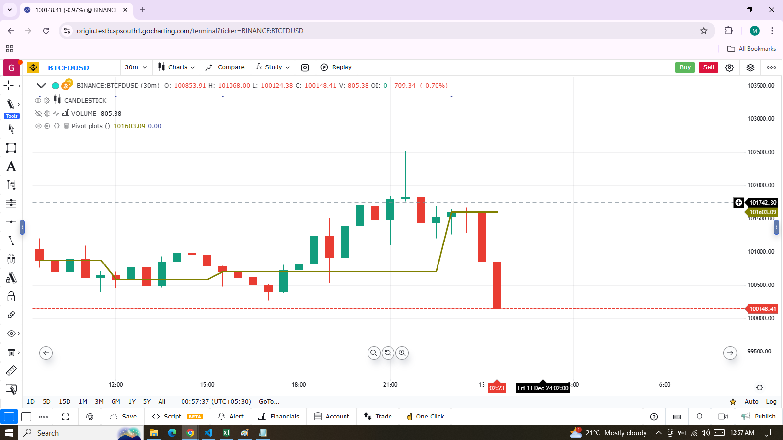
indicator("Pivot plots", "", true)
pivotHigh = fixnan(talib.pivothigh(close, 3,3))
plot(pivotHigh, "High pivot", talib.change(pivotHigh) ? na : color.olive, 3)
plotchar(talib.change(pivotHigh), "talib.change(pivotHigh)", "•", location.top, size = size.small)
Note that:
- We use
pivotHigh = fixnan(talib.pivothigh(3,3))to store our pivot values. Sincetalib.pivothigh()only returns a value when a new pivot is found, we usefixnan()to fill the gaps with the last pivot value returned. The gaps refer to thenavalues returned bytalib.pivothigh()when no new pivot is detected. - Our pivots are detected three bars after they occur because we set the leftbars and rightbars parameters to 3 in the
talib.pivothigh()call. - The last plot is continuously plotting values, but it sets the plot’s color to
nawhen the pivot’s value changes, making the plot invisible during those transitions. As a result, a visible plot will only appear on the bar following the one where we plotted withnacolor. - The blue dot marks when a new high pivot is detected, and no plot is drawn between the preceding bar and the one where the pivot occurs. The plot will be visible four bars after the actual pivot is detected, ensuring there is no plot visible during the gap.
Levels
Lipi Script provides the hline() function to plot horizontal lines (see the page on Levels). hline() is useful because it offers some line styles not available with plot(), but it also has limitations:
- It does not accept
series color. - Its
priceparameter requires aninput int/float, meaning it cannot vary during the script’s execution.
However, you can plot levels using plot() in a few different ways. Below is an example of a CCI indicator with levels plotted using plot():
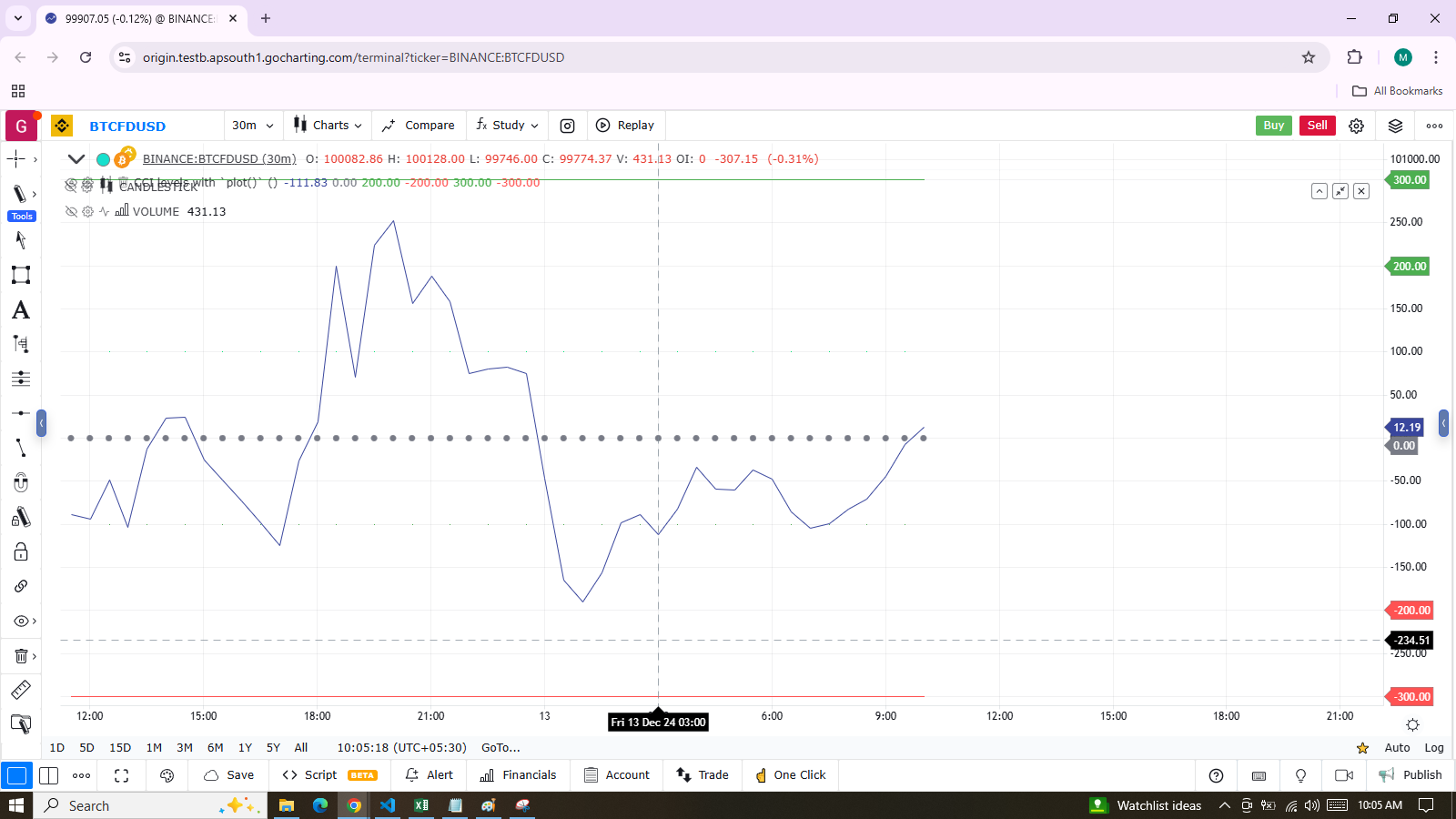
indicator("CCI levels with `plot()`")
plot(talib.cci(close, 20))
plot(0,  "Zero", color.gray, 1, plotStyle.scatter)
plot(bar_index % 2 == 0 ?  100 : na,  "100", color.lime, 1, plotStyle.linebr)
plot(bar_index % 2 == 0 ? -100 : na, "-100", color.green, 1, plotStyle.linebr)
plot( 300,  "300", color.new(color.green, 50), 1)
plot(-300, "-300", color.new(color.red, 50),   1)
Note the following details for plotting levels:
- The zero level is plotted using
plotStyle.scatter. - The 100 levels are plotted using a conditional value that only plots every second bar. To prevent na values from being bridged, plotStyle.linebr is used for the line style.
- The 300 levels are plotted using a continuous line, but with lighter transparency to make them less prominent.
Offsets
The offset parameter specifies the shift applied when the line is plotted.
- Negative values shift the line into the past.
- Positive values shift the line into the future.
For example:
indicator("", "", true)
plot(close, color = color.red, offset = -5)
plot(close, color = color.lime, offset = 5)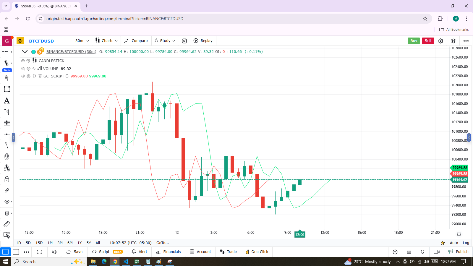
As shown in the screenshot, the red series has been shifted to the left because the argument’s value is negative, while the green series has been shifted to the right due to the positive value of the argument.
Plot Count Limit
Each script is limited to a maximum plot count of 64. All plot*() calls contribute to the plot count of a script. Some types of calls may count for more than one in the total plot count.
plot() calls count as one in the total plot count if they use a const color argument for the color parameter, which means it is known at compile time, e.g.:
plot(close, (color = color.green))When plot() calls use another qualified type, such as any one of these, they will count for two in the total plot count:
indicator("")
plot(close, color = syminfo.mintick > 0.0001 ? color.green : color.red)
plot(close, color = input.color(color.purple))
plot(close, color = close > open ? color.green : color.red)
plot(close, color = color.new(color.silver, close > open ? 40 : 0))
Scale
Not all values can be plotted everywhere. The visual space of your script is always bound by upper and lower limits, which are dynamically adjusted based on the values that are plotted. For example, an RSI indicator typically plots values between 0 and 100, which is why it is often displayed in a distinct pane — either above or below the chart.
If RSI values were plotted directly as an overlay on the chart, it would distort the symbol’s normal price scale, unless the RSI range (0-100) just happened to align with the chart’s price range. This example shows an RSI signal line and a centerline at the 50 level, with the script running in a separate pane:
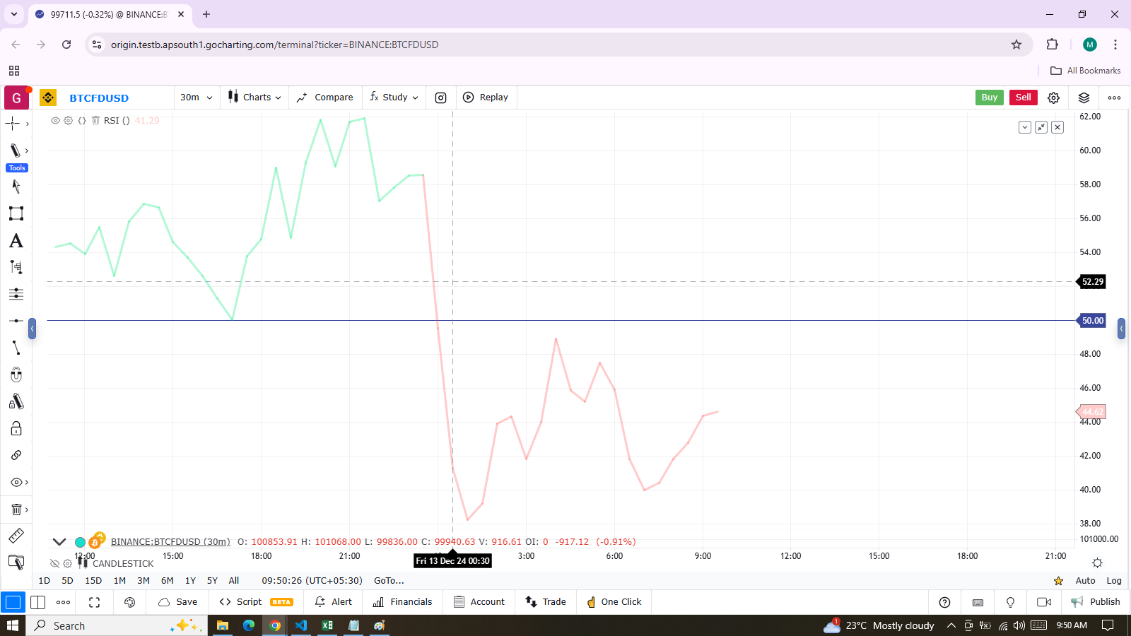
indicator("RSI")
myRSI = talib.rsi(close, 20)
bullColor = color.new(color.lime, 0.3)
bearColor = color.new(color.red, 0.3)
myRSIColor = myRSI > 50 ? bullColor : bearColor
plot(myRSI, "RSI", myRSIColor, 3)
hline(50)
Note that the y-axis of our script’s visual space is automatically sized based on the range of values plotted, such as the RSI values in this case. For more details on how colors are applied in the script, refer to the page on the color.from_gradient() function.
If we attempt to plot the symbol’s close values in the same space, by adding the following line to our script:
plot(close)This is what happens:
Note that the y-axis of our script’s visual space is automatically sized based on the range of values plotted, such as the RSI values in this case. For more details on how colors are applied in the script, refer to the page on the color.from_gradient() function.
If we attempt to plot the symbol’s close values in the same space, by adding the following line to our script:
Merging Two Indicators
When merging two indicators within the same script, it’s important to consider the scale of each. For example, plotting both the RSI and MACD within the same visual space is not feasible because RSI has a fixed range (0 to 100), while MACD does not, as it plots moving averages calculated on price.
If both indicators have fixed ranges, one approach is to shift the values of one to prevent overlap. For instance, to plot both the RSI (0 to 100) and the True Strength Indicator (TSI), which ranges from -100 to +100, we can compress and shift the TSI values so they appear over the RSI.
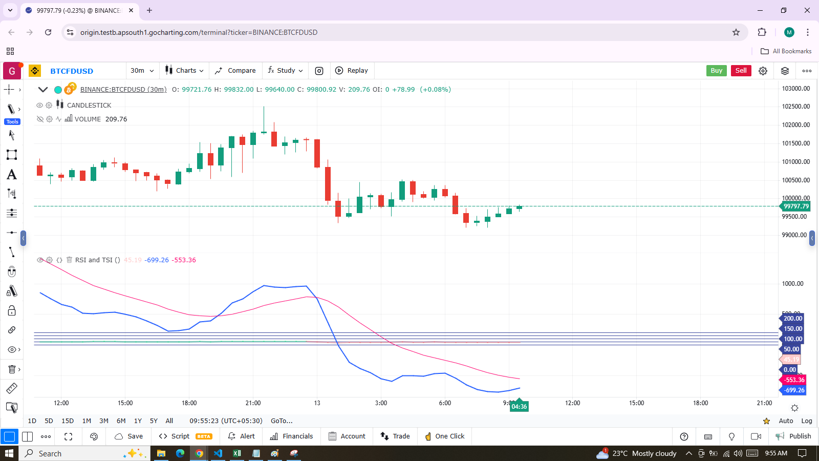
indicator("RSI and TSI")
myRSI = talib.rsi(close, 20)
bullColor = color.new(color.lime, 0.3)
bearColor = color.new(color.red, 0.3)
myRSIColor = myRSI > 50 ? bullColor : bearColor
plot(myRSI, "RSI", myRSIColor, 3)
hline(100)
hline(50)
hline(0)

// 1. Compress TSI's range from -100/100 to -50/50.
// 2. Shift it higher by 150, so its -50 min value becomes 100.
myTSI = 150 + (100 * talib.tsi(close, 13, 25) / 2)
plot(myTSI, "TSI", color.blue, 2)
plot(talib.ema(myTSI, 13), "TSI EMA", #FF006E)
hline(200)
hline(150)
Note:
In this example, we have added levels using hline() to position both signal lines.
To make both signal lines oscillate within the same 100-point range, we divide the TSI value by 2. Since TSI has a range of 200 (-100 to +100), dividing it by 2 scales it down to a 100-point range. We then shift this value upwards by 150 so that it oscillates between 100 and 200, with 150 as its centerline.
These adjustments are typical when merging two indicators with different scales into the same visual space. Even though both indicators have bounded ranges, as with TSI, it’s necessary to manipulate their values to make them fit within the same chart space, unlike MACD which doesn’t have fixed boundaries.
