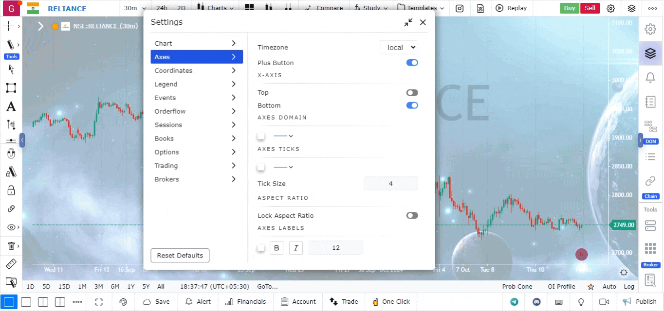
Axes Settings
Overview
Axes settings allow you to customize the appearance and functionality of the axes on your charts. These settings enhance chart interaction, making it easier to analyze price movements and execute trades directly from the chart.
Accessing Axes Settings
- The Axes Settings can be found in the Top Right Corner of the platform.
- Click on the settings icon to open a new panel, and from the left side of this panel, select the Axes Settings option.
Available Axes Settings
-
Plus Button for Placing Orders
- The Plus Button feature allows you to place orders directly from the chart.
- Click the plus button to get quick options for placing limit orders, market orders, or stop orders, streamlining the trading process.
-
X-Axis Position
- You can choose to display the X-axis data at the top or bottom of the chart.
- This flexibility helps in organizing the chart layout according to your preference.
-
Tick Size Adjustment
- The tick size setting lets you customize the spacing of dash lines (tick marks) on the axes.
- Adjusting the tick size helps in refining the precision of price and time data display.
-
Aspect Ratio for Zoom
- You can control the aspect ratio of the chart when zooming in and out.
- This setting ensures that the chart scales properly, maintaining the right balance between the X and Y axes.
-
Color and Text Size for Axes Labels
- Customize the color and text size of the labels on the axes to improve chart readability.
- Adjusting these visual aspects makes the data on your chart clearer and easier to interpret.
Conclusion
The axes settings provide a variety of customization options that enhance both the functionality and visual clarity of your charts. These tools ensure that you can analyze and interact with your charts in a way that best fits your trading style and preferences.
Use Case
Axes Settings in GoCharting control the price scale (y-axis) and time scale (x-axis) display, including logarithmic vs. linear scale, auto-scaling behaviour, and visible price range. Correct axis configuration is fundamental for accurate technical analysis.
Strategy
Use logarithmic scale for long-term charts of assets that have grown significantly (e.g., stocks, crypto) to show proportional price moves. Switch to linear scale for short-term intraday charts where absolute price movement matters more than percentage change. Set auto-scaling to keep recent price action filling the chart view.
Common Mistakes
Do not use linear scale for assets that have moved hundreds of percentage points — it distorts the visual weight of earlier price action. Avoid manually fixing the y-axis range during volatile markets as it can cut off relevant price levels. Do not ignore that different scale types can make the same price pattern look completely different.