Imbalance Charts
What makes the price of security move? It’s the buyers and sellers. Wouldn’t it be useful if we could quickly visualize when large buyers or sellers enter the market? To do this we can look at buy and sell imbalances on a footprint chart. Imbalances are simply a lot more aggressive buyers than sellers, or a lot more aggressive sellers than buyers at a given price.
Imbalance is a special variation of the Footprint chart that highlights aggressive buying and selling (some market participants manifested aggressive behavior)
**Imbalance** in footprint chart highlights the price levels where a buy trade volume is excess over a sell trade volume. Diagonal Bid/Ask imbalance displays aggressive buy market orders lifting the offer and aggressive sell market orders hitting the bid.
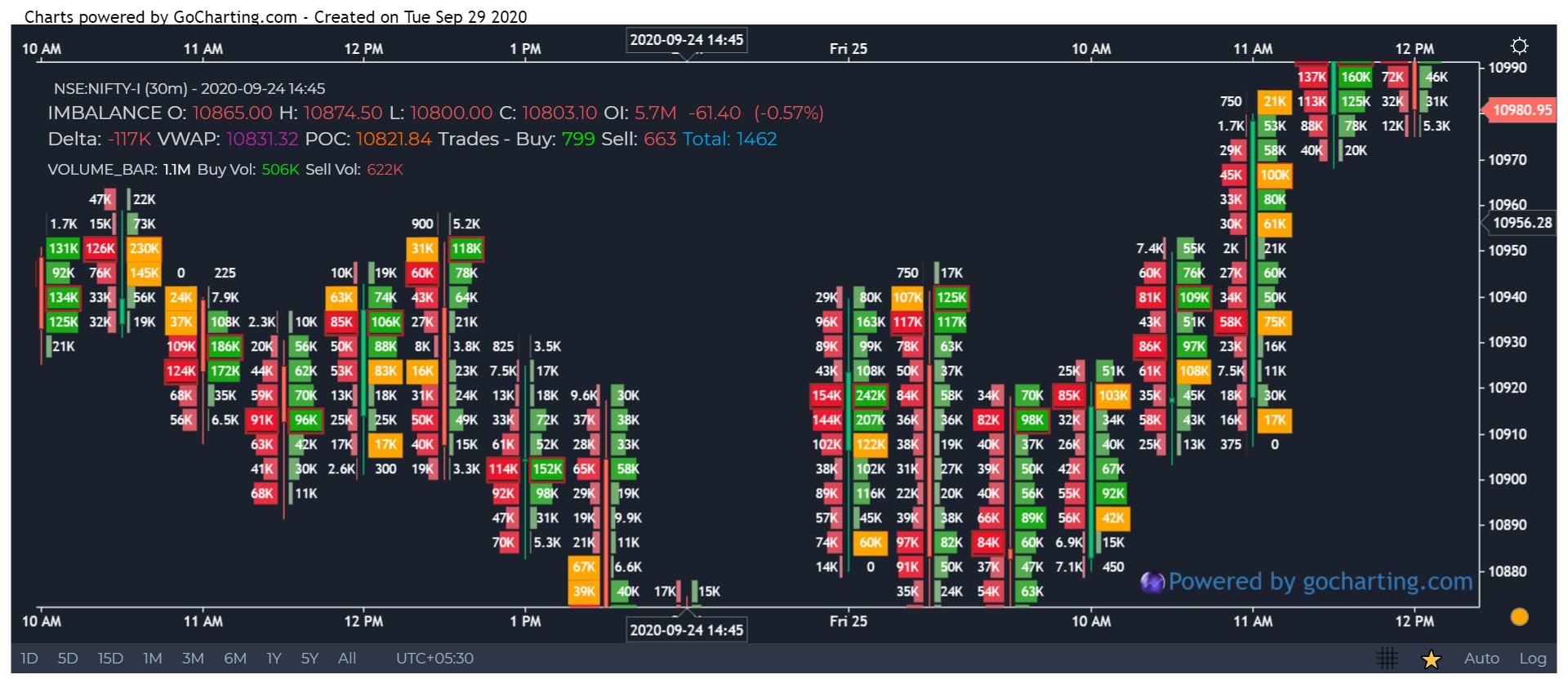
Imbalance compares bids and asks diagonally and shows a significant excess of one over the other. That is, a bid is compared with an ask, which is one level higher, and an ask is compared with a bid, which is one level lower.
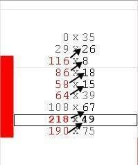
The bar in the picture above shows how aggressive sellers entered the market and pushed the price at each price level. Such an aggression, as a rule, results in price reduction. The yellow highligted cells reflect such aggressive behaviour on the buy and sell sides
How to add Imbalance Chart
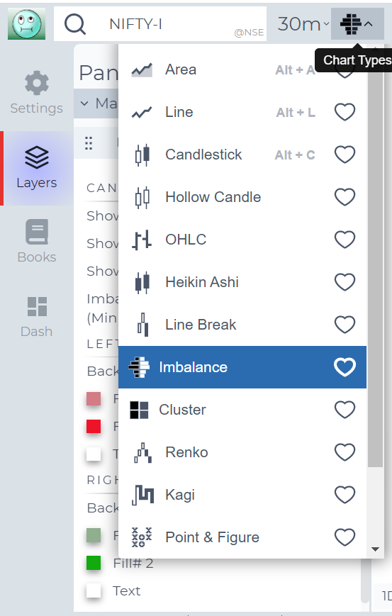
To activate the Imbalance chart, simply choose the chart type from the dropdown
Imbalance Chart Settings
Click on the gear icon on the Chart Legend/Tooltip to open the Settings Dialgue for Imbalance Charts
Lets look at all the options
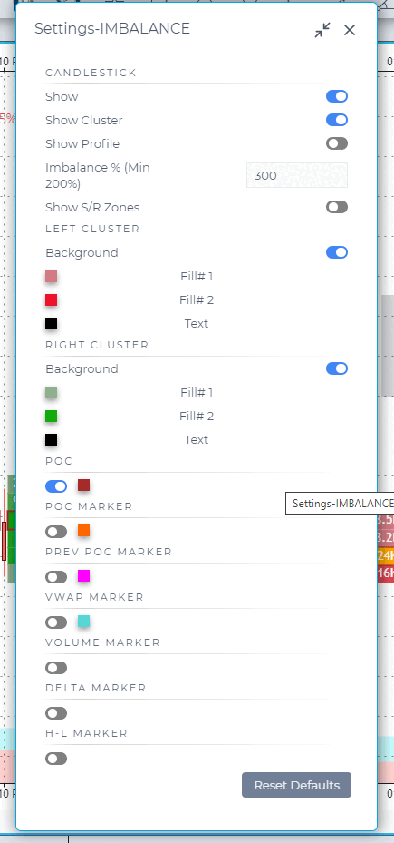
In the Imbalance chart settings, you can specify the ratio between buying and selling volumes diagonally at each price level. For example, Ratio = 3 will show on the chart all the imbalances, where the excess of buying over selling will be above 300%.
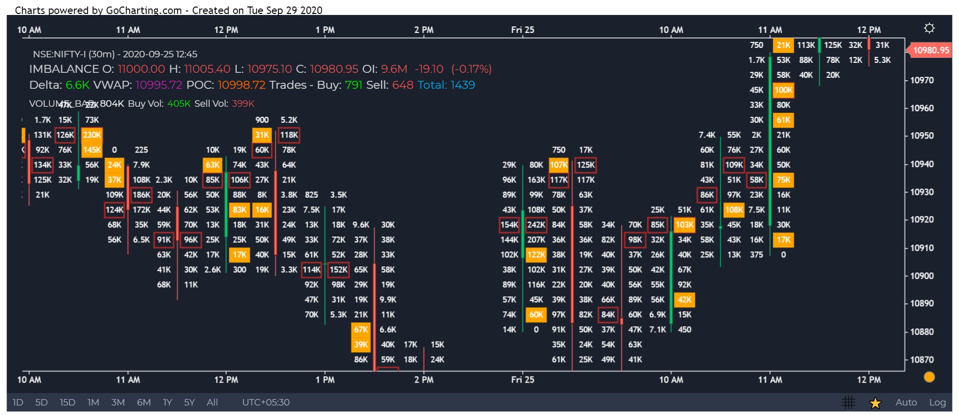
Stacked Imbalances shows zones of multiple consecutive imbalances that occur on bid or ask side. These zones are important support/resistance levels because they are levels where participants aggressively wanted to get into the market. So when the market retests those levels, the same participants may appear again.

Use Case
Imbalance Charts highlight price levels where there was a significant bid/ask volume imbalance within a bar, revealing where aggressive buying or selling overwhelmed the opposing side. These imbalance zones often act as future support and resistance levels.
Strategy
Mark the largest buying imbalances and selling imbalances on your chart. When price returns to a major buying imbalance zone, treat it as potential support and look for bullish entry signals. Selling imbalances act as resistance on subsequent retests.
Common Mistakes
Do not treat every imbalance as a trade trigger. Focus on the largest, most asymmetric imbalances at structurally significant price levels. Avoid using imbalances on low-volume instruments where statistical significance is diminished. Do not ignore that imbalances can be faded by subsequent orderflow.