To learn more about order flow, liquidity, Footprint Charts and volume, traders can utilise a variety of tools and trading charts. Given the variety of choices, it’s crucial to comprehend how they differ from one another.
In this article, we examine how traders analyse market liquidity and volume using the DOM, Footprint (FP), and Volume Profile trading charts. We also go through how Bookmap presents this data and why it has an edge over other chart formats for traders.
Depth of Market (DOM)
The Depth of Market (DOM) is the easiest tool to utilise to obtain information about the price levels at which limit orders are situated. The order book is another name for this. The DOM is a standard feature of the majority of trading platforms.
The quantity of contracts that make up limit purchase orders at each price level is displayed in the left column (blue) of a DOM. The opposite information—the number of contracts that limit sell orders at each price level—is shown in the right-hand red column. The current price is delineated from those above or below it by a horizontal bar. Only limit orders, not stops, are displayed in the DOM.
Trading with a DOM
A trader who is adept at using a DOM may be able to identify market imbalances that might have an impact on prices.
For instance, the price may be supported if a certain price level has an abnormally high number of contracts on the bid. A long trade can be started here, or a long trade can have its stop placed here. On the other hand, if the price crosses this threshold, it can mean that a lot of market sell orders are being placed. Going short can be an option here.
Benefits and disadvantages of using a DOM
A DOM has the benefit of providing traders with information regarding market liquidity. Candlesticks or bar charts cannot display this data.
It also has two major drawbacks, though. First off, a DOM only reports data about present-day liquidity. It doesn’t provide any information on what happened in the past or what could have led to the present level of market liquidity.
Consider the DOM showing 371 contracts for ES futures sold at $2789.50 as an example. But suppose that a single large organization offers 300 of these contracts. The DOM will alter to display 71 contracts for sale at that price if this institution cancels its order.
The trader won’t be aware that a sizable order was just cancelled unless he was keeping an eye on that specific price at the time. However, this cancelled order could have a significant effect on the market since high-frequency trading algorithms might behave differently as a result (they might start purchasing, for instance). The DOM’s use is severely constrained by this information blind spot.
Second, the DOM provides no more details on market orders beyond the size of the most recent transaction. In contrast to a volume indicator, it does not demonstrate the volume of market orders over time. This might make it challenging to understand why a specific price level was crossed. The DOM is a useful tool as compared to utilizing merely a price chart, despite these drawbacks. However, there are still more sophisticated techniques available to analyze market liquidity.
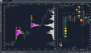
Footprint charts
Many traders now employ Footprint charts because the DOM provides no data on past market orders. Charts with footprints produce a “candle” that resembles a candlestick chart. However, these candles represent the volume of market buyers and sellers at each level during that interval rather than the open, close, high, and low price for that time period.
There are two numerals at each pricing level, divided by a vertical line. The quantity of market sell orders that hit the bid at that specific price is indicated by the number to the left of the vertical line. The quantity of market purchase orders that met the ask price at that specific price is indicated by the number to the right of the vertical line.
Footprint Charts compares the number to the left at a specific level with the number to the right one level below it in order to identify market imbalances (the spread is taken into account by comparing the two distinct levels). If the number on the left is significantly higher than the number on the right level below, it indicates that there are many more market sell orders than market purchase orders being placed. This suggests pushy selling.
If, on the other hand, the number on the right at a certain level is significantly higher than the number on the left one level above, this indicates that a lot of market purchase orders are being issued. This suggests impulsive purchasing.
Trading with a Footprint chart
A trader who is adept at utilizing an Footprint chart could be able to spot market imbalances as they develop.
Let’s use the growing price as an example. Aggressive purchasing may be indicated by an Footprint chart. Consider a scenario in which the price stops out and the Footprint chart reveals frantic selling. This can indicate a reversal is taking place.
Benefits and disadvantages of using an Footprint chart
An Footprint chart’s advantage is that it provides data on the quantity of market orders. Both the DOM and price charts are unable to display this information.
However, employing an Footprint chart has some substantial drawbacks as well. And traders ought to take these into account.
First, Footprint Charts only provide data related to volume and not liquidity. An Footprint chart will show this information if far more traders are pressing the “market sell” button than the “market buy” button. However, this does not imply that there is a market imbalance. It’s possible that vendors are supplying a significant volume of limit purchase orders. If so, a trader utilizing a footprint chart won’t be able to see these limit orders.
Second, Footprint charts share many of the same issues as the DOM since they do not display liquidity. They do not indicate whether a significant institution or several traders have cancelled limit orders. Without this knowledge, traders might be unable to comprehend why the price is acting in the manner that it is.
Footprint charts may be a helpful tool in some situations, just like the DOM. However, there are more effective techniques to comprehend the industry.
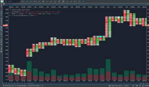
Volume Profile charts
Volume Profile charts is another well-liked method for comprehending the flow of orders. A Volume Profile chart is a histogram that displays the quantity of market orders placed at each price level over a certain period of time. This enables the trader to determine which price ranges generate the most market orders. The Point of Control is the pricing level with the highest volume. Volume Profile traders think that the price tends to retrace its steps, or at least to remain close to them.
Benefits and disadvantages of using a Volume Profile chart
Volume Profile charts, like the DOM and Footprint charts, may be helpful in certain situations. They could make it possible for dealers to identify when a certain price is luring buyers and sellers.
However, much like the other chart styles discussed, Volume Profile charts also have drawbacks. Volume Profile charts, like Footprint charts, only display volumetric data. They provide no liquidity-related information. Because of this, volume profile charts have the potential to provide inaccurate information.
For instance, there can be a lot of transactions happening at a certain price just because there are a lot of limit orders at that price. It’s possible that volume won’t return to that level if these orders are cancelled.
Volume Profile is a chart type that can occasionally be useful, much like the other chart types on this list. However, there is a more efficient approach to provide market data.
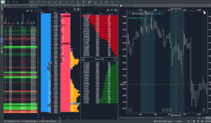
Trading with Bookmap
Trading using Bookmap offers traders the benefits of DOM, Footprint, and Volume Profile charts without the drawbacks. Looks fantastic, doesn’t it? This is how Bookmap presents data on market volume and liquidity. When opposed to utilizing other types of charts, Bookmap enables traders to quickly and easily find information about the market.
A trader can anticipate resistance when the price reaches a broad band of liquidity, for instance, if he observes the price rising upward in that direction. He can keep an eye out to see whether the line of liquidity vanishes if there are huge volume bubbles when the price gets there. If it does, it indicates that the limit orders at that level have been cleared by market orders. This can indicate that a price increase is imminent.
Conclusion
Traders have a variety of techniques at their disposal for analysing market liquidity and volume, each with advantages and disadvantages. Although it lacks historical context and information on market orders, the Depth of Market (DOM) provides real-time insight into limit order levels. Footprint charts, which visualize market order imbalances, fill this gap, although they, too, exclude information on liquidity. Volume Profile charts ignore liquidity dynamics in favor of volume distribution.
It’s crucial to have the capacity to interpret complicated market data in the dynamic world of trading. While DOM, Footprint, and Volume Profile charts have their advantages, Gocharting stands out as a game-changer by providing traders with a thorough and user-friendly means of navigating the complex world of order flow, liquidity, and volume analysis.